
 Home
Home
Key Takeaways
- Forecast Source: This list shows Viettimecraft’s own 2027 color trends forecast. It comes from our own sourcing work and buyer feedback across rattan, seagrass, and bamboo collections.
- Natural Fiber Foundation: Rattan, seagrass, and bamboo are still top picks for colorful handmade pieces. That’s because their natural texture works with both bold and soft colors.
- Core 2027 Color Trends: The five colors we’re tracking are Luminous Blue, Energy Orange, Pop Pink, Meadowland Green, and Clay. Together, they cover bold, standout shades and calm, neutral ones.
- Buyer Takeaway: The best collections use one bold color as the star, paired with natural materials. Mixing too many bold colors in one line tends to work less well.
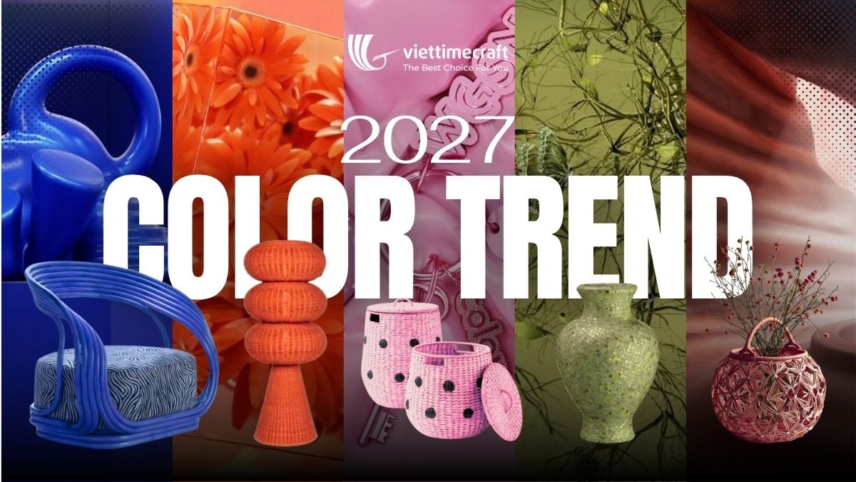
The 2027 color trends are already changing how buyers pick handmade home decor. Instead of focusing on just one “color of the year,” 2027 brings five different colors to choose from. What’s more, each one is designed to work beautifully with natural materials like rattan, seagrass, and bamboo. For this reason, importers and wholesalers planning next year’s collections should start paying attention now. By getting ahead of these trends, brands can launch product lines that feel fresh and relevant. As a result, they can stay a full season ahead of the competition.
What’s Driving the 2027 Color Trends in Home Decor
The 2027 palette is about contrast, not one single neutral shade. Buyers want colors that feel different from room to room. Bold blue suits a standout corner. Warm clay grounds a living space. At the same time, natural weaves keep everything textured and sustainable. This mix of bold color and handmade material is what makes the 2027 color trends work so well. Rattan, seagrass, and bamboo simply take color well. They don’t lose their natural look in the process.
For factories and design teams, this also changes how color gets planned. It needs to be part of the plan from the start, not added at the end to a finished basket or chair. So, it pays to understand each of these five 2027 color trends before placing a wholesale order.
1. Luminous Blue
Luminous Blue (125–28–38) opens the 2027 color trends with a shade that is bold yet serene, fresh, futuristic, and timelessly inspirational at once. It reads as confident without tipping into cold, which is why it works equally well as an accent pillow or as a full lacquered rattan armchair.
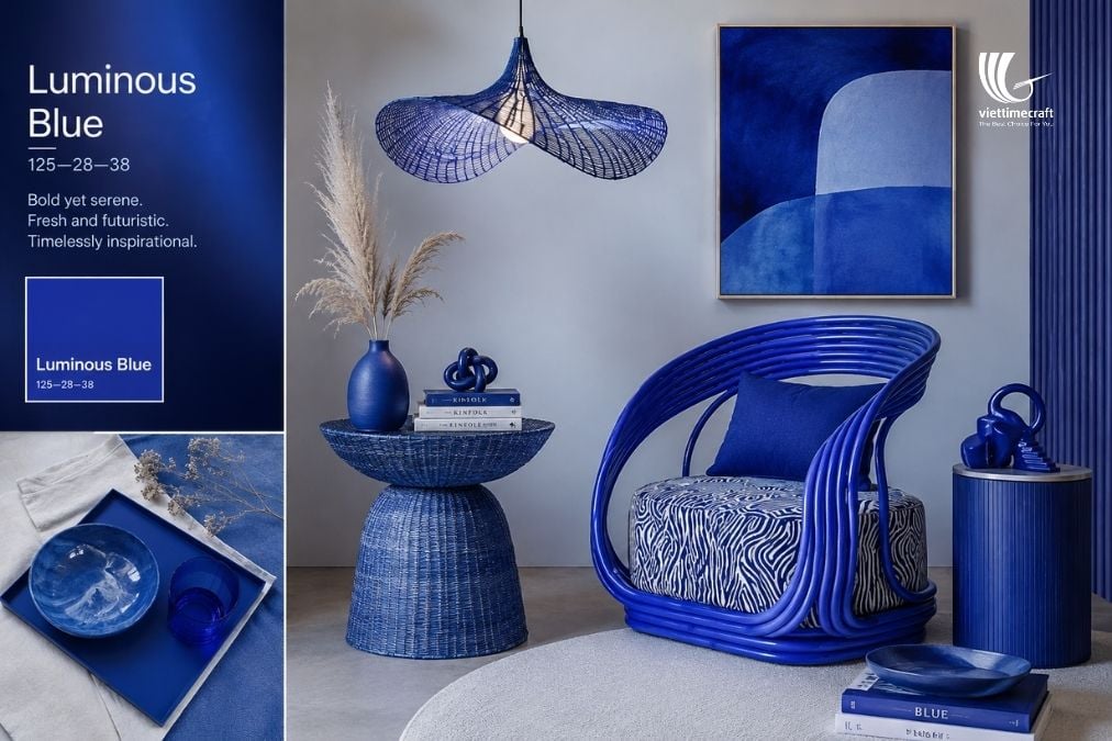
In handmade collections, Luminous Blue suits lacquered furniture, woven pendant lamps, and glazed ceramics. Paired with pattern, like a zebra-print cushion or a textured throw, it becomes a genuine statement piece rather than just an accent color, making it a strong pick for buyers who want a hero SKU in their next catalogue.
2. Energy Orange
Energy Orange (018–57–34) is warm and full of life, a color that sparks action, creativity, and joy. Among the 2027 home decor color trends, it’s the shade most likely to be the star of a room instead of staying in the background.
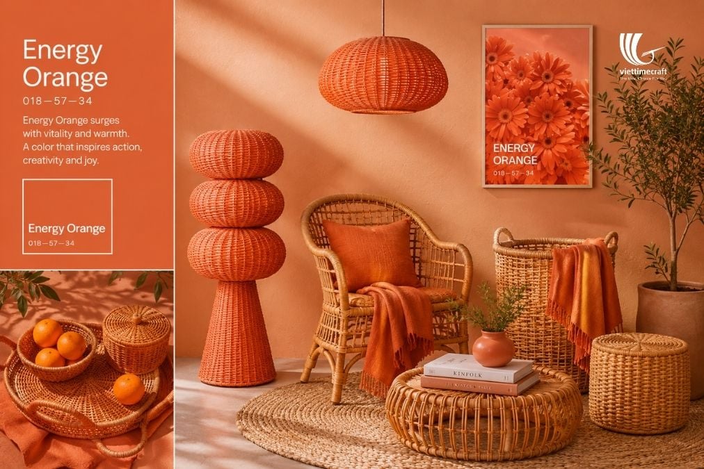
Woven rattan chairs, stacked decor towers, and fringed throws all show off Energy Orange well, especially against warm neutral walls and jute rugs. For handmade home decor brands, this shade photographs well for seasonal campaigns. It also works as a focal piece in showroom displays or catalogue shots.
3. Pop Pink
Pop Pink (151–73–22) is playful, bold, and full of personality. In fact, it’s the kind of color that lifts the mood of an entire room. As a result, it is the most expressive of the 2027 color trends and pairs naturally with rattan headboards, cane furniture, and woven storage.
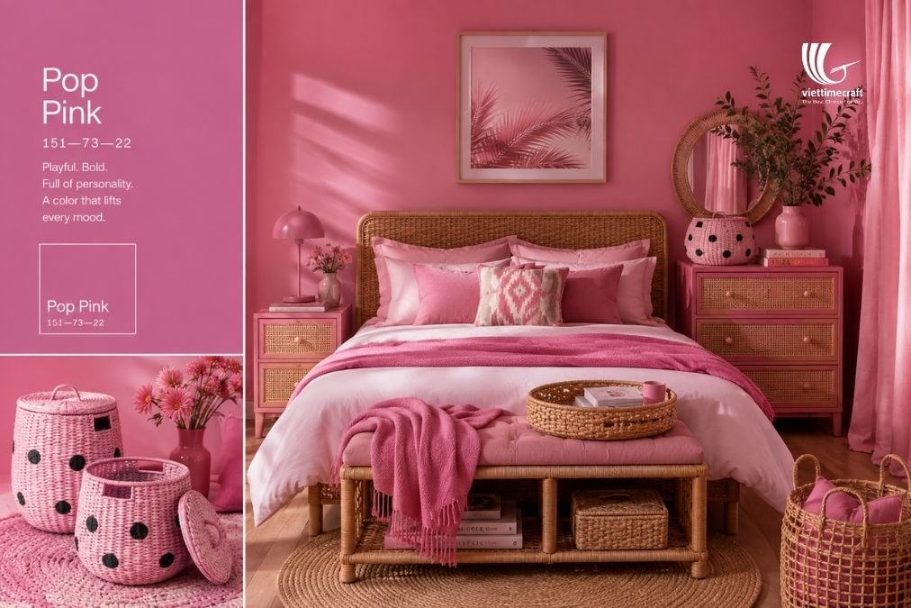
Buyers targeting younger, design-forward retail customers will find Pop Pink especially strong in bedroom textiles, decorative baskets with contrast dot patterns, and small accent vases. It softens well when balanced against natural cane tones, keeping the overall look playful rather than overwhelming.
4. Meadowland Green
Meadowland Green (950–61–19) feels natural, calm, fresh, and timeless. It brings balance to any space it enters. Of all five 2027 home decor color trends, it’s the easiest to add to an existing product line. That’s because it feels like a natural extension of rattan and wood, not a big change.
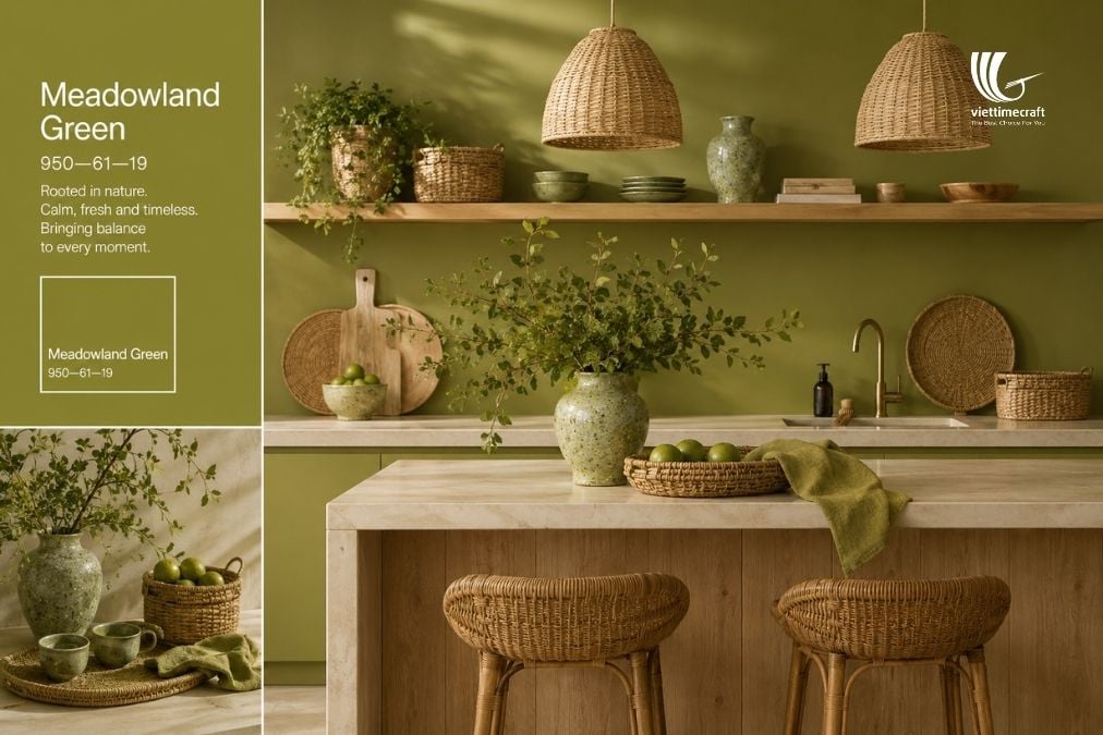
Ceramic vases, woven pendant shades, and kitchen items all suit Meadowland Green, especially when paired with light wood and stone counters. It’s a safe pick for buyers who want a fresh color without straying too far from best-selling neutral lines.
5. Clay
Clay (128–37–26) closes out the 2027 color trends with something earthy, grounded, and naturally timeless, warmth expressed in every weave. As a wall color and product tone, Clay lets raw rattan and bamboo textures do the visual work, keeping the palette quiet but rich.
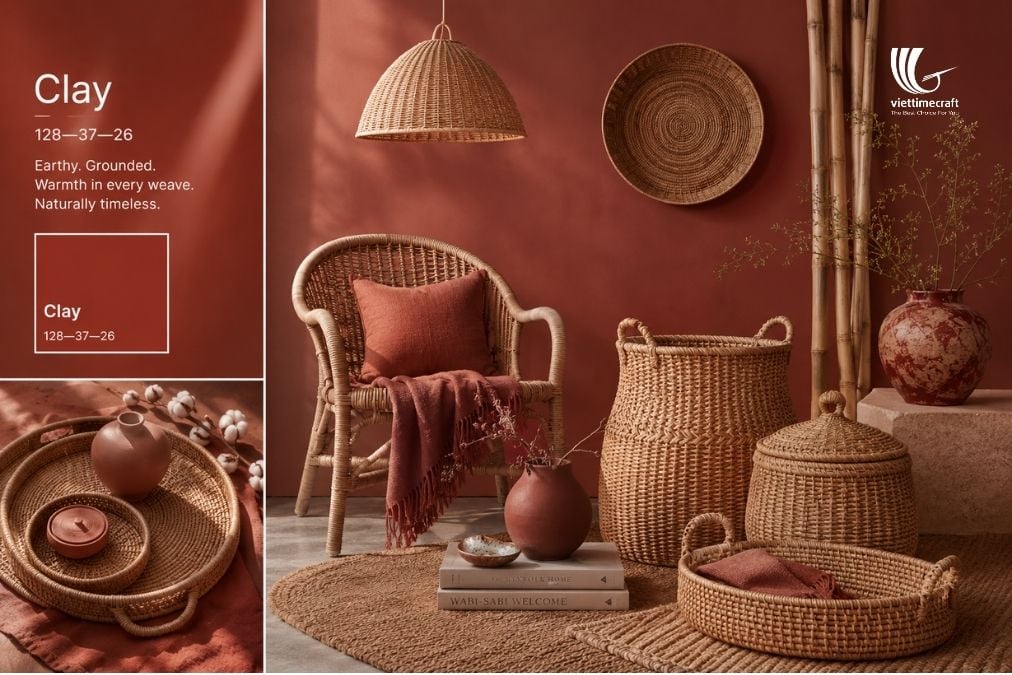
This tone works well on trays, lidded baskets, and terracotta-style vases, especially styled with dried plants and jute rugs. Since Clay is close to the natural fiber colors already used in most handmade home decor, it’s one of the easiest 2027 color trends for factories to adopt. No need to change existing dye methods.
Predicted Favorite Colors for the Coming Seasons: Crystal Rose and Chambray Blue
Beyond the five core 2027 color trends, some shades are already gaining strong attention and are likely to become even more popular in the near future. Crystal Rose and Chambray Blue stand out as two colors with very different moods, yet equal potential in home decor and handmade design.
1. Crystal Rose
Crystal Rose (Pantone 12-1708 TCX) is a soft, gentle pink with a light blush tone. Compared with the bolder Pop Pink above, this shade is quieter and easier to use, which makes it a great fit for modern, simple interiors. It adds warmth and a romantic touch without taking over a room.
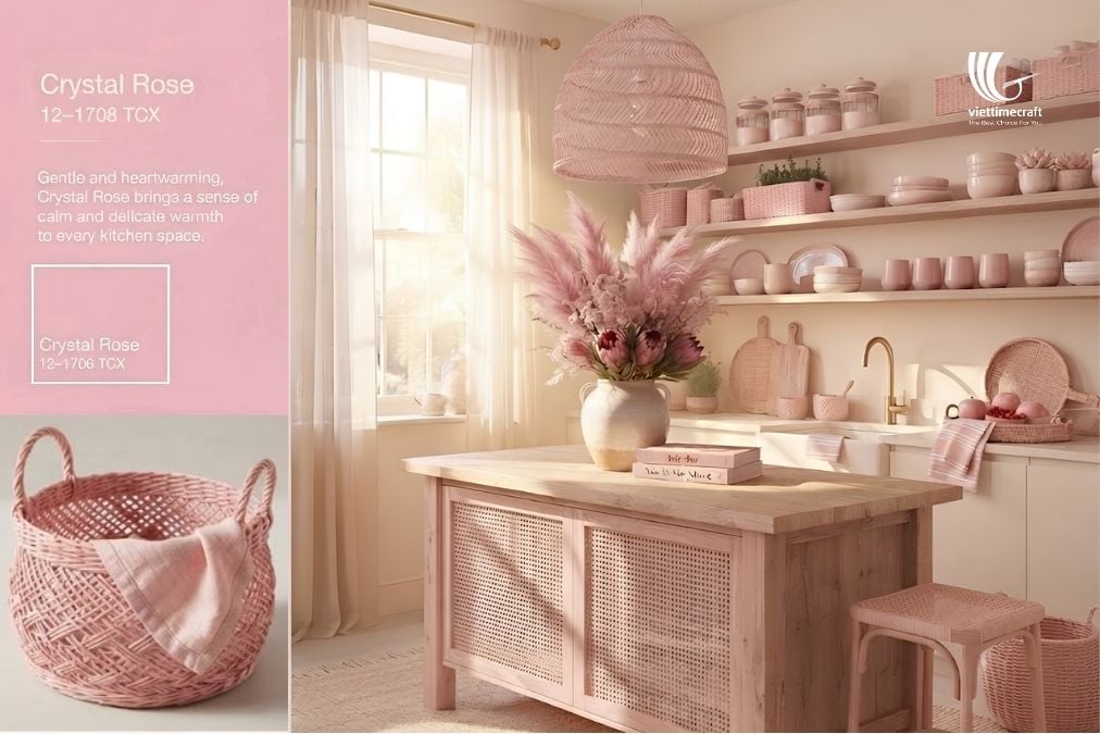
In handmade home decor, Crystal Rose can work beautifully for:
- Woven storage baskets.
- Cushion accents.
- Table decor.
This color pairs well with cream, natural beige, light wood, rattan, and other natural materials. For handmade brands, Crystal Rose offers a fresh way to add softness while keeping the design elegant and easy to sell.
2. Chambray Blue
Chambray Blue (Pantone 15-4030 TCX) is calm, clear, and easy to use anywhere, giving a sense of ease and quiet confidence to any space. Unlike the bolder Luminous Blue above, it’s a softer, more everyday version of blue that fits a wider range of interiors.
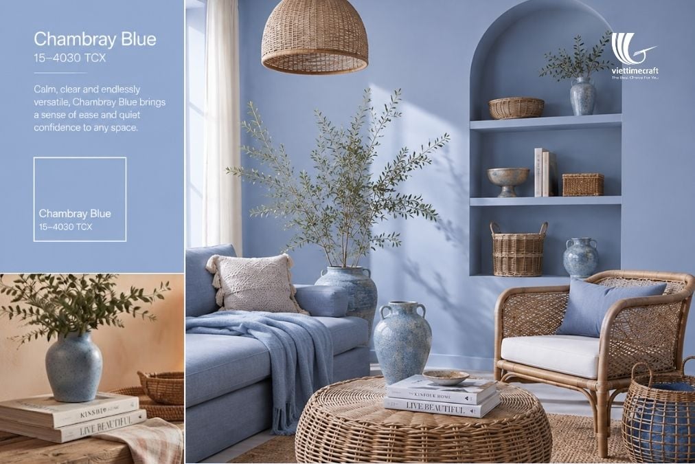
Chambray Blue pairs well with rattan, light wood, jute, and off-white tones. You can use it as a wall color for a reading nook, or as a soft alternative for buyers who want the calm of blue without the boldness of Luminous Blue in their next 2027 color trends collection.
Visit our website to explore more handmade collections inspired by the color of the year and trending palettes: Viettimecraft or Facebook.
READ MORE:
- Color Palette Trends 2026-2027: Fresh Interior Design Schemes
- Visit Viettimecraft at VIFA EXPO 2026 Trade Fair
- Top Handmade Craft Ideas 2026: Innovative Art & Craft Trends